Color Chips Rule
I always felt guilty walking out from the paint department of a home improvement store with a handful of color chips. I loved shuffling through them, comparing them, wondering at their subtle shades, juxtaposing them, again and again. As a child I always had a love of color, thinking that my Crayola colors looked delicious enough to eat, and now and then I bit into them, never tasting lime, only wax. More appealing than just the single color swatches in the store were the strips with bars of different values, swinging my eyes back and forth from light to dark. Seeing them brought the dawn of understanding that my professor in two-dimensional design class didn't seem to get through to me.
How to use them in my art was the challenge. Just gluing them onto paper or canvas wouldn't be good enough. The challenge was integrating them into the composition, making them emerge, or reveal a little surprise to the viewer.
Not long ago while visiting a Robert Rauschenberg exhibit, I couldn't help but step close to explore one of his collaged paintings. It was utterly sensuous, a feast for hand and eye, and rewarded me with an "aha" moment--there it was--the paint chip--embedded into the thick paint along with scraps of cloth and used coffee filters. It was a masterwork of color, texture, and value, the chips nestled in the luscious goo of paint, their subtle values meek but visible.
Naturally I went home and got out my paint swatches, intent on giving them a place in one of my artworks, an homage to my Crayola days, to Rauschenberg's daring use of the banal details of life, and that "aha" moment I hope someone else might have. Paint chip A183 became part of my collage painting , a touch of my world within rememberances of the Minoan past. A priestess brings an offering to the Goddess, amidst a background of frescoed walls, one of which is the color of A183.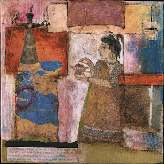
Now I see that the paint chip has taken a spotlight all on its own! What better way for Sherwin-Williams Paint to market its wares than through these deliciously colored paper bits. When I first saw their commercial, I was entranced. Their ad agency, McKinney, used clever animations, precise lighting, and ingenious folds, stacks, rolls and wraps to make the paint chips into an alternative reality that appeals to everyone, especially a color-freak like me. I'm sure you'll enjoy them too.
How to use them in my art was the challenge. Just gluing them onto paper or canvas wouldn't be good enough. The challenge was integrating them into the composition, making them emerge, or reveal a little surprise to the viewer.
Not long ago while visiting a Robert Rauschenberg exhibit, I couldn't help but step close to explore one of his collaged paintings. It was utterly sensuous, a feast for hand and eye, and rewarded me with an "aha" moment--there it was--the paint chip--embedded into the thick paint along with scraps of cloth and used coffee filters. It was a masterwork of color, texture, and value, the chips nestled in the luscious goo of paint, their subtle values meek but visible.
Naturally I went home and got out my paint swatches, intent on giving them a place in one of my artworks, an homage to my Crayola days, to Rauschenberg's daring use of the banal details of life, and that "aha" moment I hope someone else might have. Paint chip A183 became part of my collage painting , a touch of my world within rememberances of the Minoan past. A priestess brings an offering to the Goddess, amidst a background of frescoed walls, one of which is the color of A183.

Now I see that the paint chip has taken a spotlight all on its own! What better way for Sherwin-Williams Paint to market its wares than through these deliciously colored paper bits. When I first saw their commercial, I was entranced. Their ad agency, McKinney, used clever animations, precise lighting, and ingenious folds, stacks, rolls and wraps to make the paint chips into an alternative reality that appeals to everyone, especially a color-freak like me. I'm sure you'll enjoy them too.
Labels: collage, color, composition in art, Crayola, crayons, paint chip, Rauschenberg, Sherwin-Williams, value
posted by Studio Codex's Art Decoded at 5:34 PM
![]()

0 Comments:
Post a Comment
<< Home